Learning to See.
Turning passive visual inspiration into an active learning experience through writing and feedback.
🚀 Brief & live demo
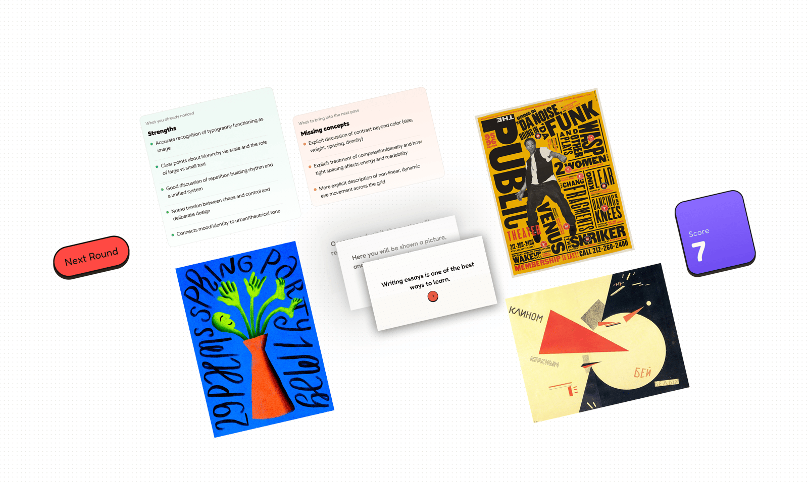
This project is more like a UX challenge: making educational essay writing engaging. I also made a live demo, which requires no registration.
📝 Below there are sample essays for recruiters who want to try the experience without spending time writing responses from scratch.
Cheat Codes
Round 1
Paula Scher’s The Public Theater, 95–96 Season uses typography as both information and image. The poster feels loud, energetic, and urban because of the oversized text, tight spacing, and stacked composition. Instead of guiding the viewer through a quiet, orderly layout, it creates movement by making the eye jump between large and small typographic elements. Hierarchy is created mainly through scale. Some words immediately dominate, while smaller text adds detail and texture. Repetition helps unify the design and gives it rhythm. Even though the composition feels chaotic at first, it is actually very controlled. The arrangement of the type is deliberate, which allows the poster to feel expressive without becoming unreadable. What makes this poster so effective is that its typography communicates mood as much as message. It does not just advertise a theater season — it visually expresses something public, theatrical, and culturally alive.
Round 2
The poster feels playful and expressive because it combines bright color, organic shapes, and hand-drawn typography. The vivid blue background creates a strong contrast with the orange vase and neon green plant forms, making the central image stand out immediately. This bold palette gives the composition a lively and energetic mood. The plant-like figure is highly stylized, with arms, hands, and a face that make it feel animated and almost human. This creates a sense of personality and movement, as if the plant is performing or growing freely. The handwritten text surrounding the image reinforces this feeling, because it feels loose, rhythmic, and spontaneous rather than formal. Altogether, the poster communicates a cheerful and experimental visual language.
Round 3
The poster’s main strength lies in its extremely simple yet powerful geometric composition. The large red wedge pushes into the white circle, so the image immediately suggests movement, attack, and conflict. The strong contrast between red, white, and black makes the poster highly readable while also reinforcing its political message. The diagonal structure and asymmetrical layout create a sense of dynamism, making the composition feel active rather than static. What is especially striking is that the poster tells a story entirely through abstract forms, without showing any people or realistic scenes. This makes it an iconic example of how visual design can communicate meaning with minimal elements.
🧠 The Problem
This project started from a learning problem I kept noticing in online education.
People who try to learn new skills online often face an overwhelming amount of content, but very little guidance. Unlike traditional education, online learning is rarely shaped by a clear curriculum, direct feedback, or a mentor who helps structure attention. As a result, the process can feel lonely, fragmented, and difficult to evaluate.
I ran into this while trying to learn graphic design online. Tutorials for tools like Photoshop, Figma, or Canva are easy to find, but at some point it becomes clear that software skills alone are not enough. To understand graphic communication, you also need to study design theory and learn how to read strong visual work.
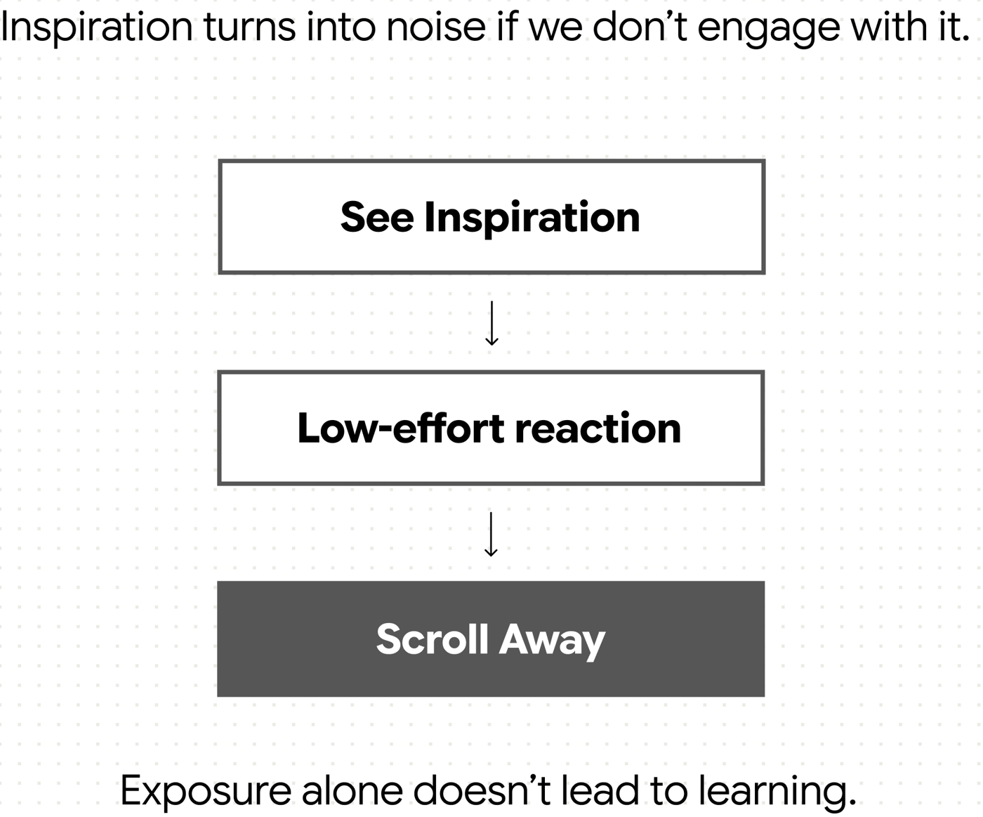
A common advice is to look at great posters and design pieces and spend time thinking about them. I tried to do exactly that. But over time, I noticed that in a digital environment, even this kind of study can collapse into passive scrolling. Good work is extremely accessible through platforms like Pinterest and design media sites, but the same platforms also train fast, low-attention consumption.
Instead of studying, I often found myself browsing. I had seen a lot, but retained very little. The experience felt unstructured, unproductive, and frustrating.
So the core problem became clear: material that should support active learning can easily turn into passive consumption.
In short, I caught myself scrolling through works that should have been studied.
🧩 The Logic
I began by thinking about what this learning experience is missing for an online solo learner.
In an ideal setting, someone learning graphic design theory could ask questions, hear expert interpretation, and receive feedback from a teacher. That is part of what makes formal education valuable. Online self-learning, by contrast, offers access to content but rarely recreates that guided, reflective experience.
My goal was to design something that interrupts passive browsing and turns it into active engagement.
I explored a few directions first. One option was to create a curated sequence of posters, almost like a study path. I also considered reconstruction-based exercises, where the user would rebuild parts of a composition. I dropped that idea quickly because it would have moved the project toward imitating design software rather than supporting observation, interpretation, and critical thinking.
I chose essay writing as the core interaction.
At first glance, this is not the most attractive format. Writing takes time, feels effortful, and many people associate essays with school pressure rather than curiosity. But that was precisely why it felt right. Writing forces the user to slow down, observe carefully, form judgments, and articulate ideas in their own words. It transforms vague visual impressions into explicit thinking.
That said, writing alone is not enough. In education, the value of an essay does not only come from producing it, but from receiving a response to it. A teacher validates strong observations, points out gaps, and helps the learner notice what they missed. That reaction is what makes the process feel meaningful and rewarding.
This became the central product idea: create a learning loop built around observation, articulation, and feedback.
To make that possible, I introduced a hidden “master analysis” for each artwork. This is a detailed curator-written interpretation that acts as a reference point. After the user submits their own analysis, an AI compares the user’s text to the master analysis and generates feedback. The AI is not asked to replace artistic judgment or decide what makes the artwork meaningful on its own. Its role is narrower and more reliable: to compare two texts, highlight strong matches, and point out missing concepts.
This allowed me to design a digital experience that captures part of what makes guided learning valuable, without pretending to replace a human teacher entirely.
🍰 The Outcome
The result is a solo-developed live demo web application built around a simple but demanding interaction: study an image, write an analysis, and receive feedback.
Visually, I chose a playful, colorful, slightly game-like direction. Since essay writing can feel intimidating or overly academic, I wanted the interface to feel inviting rather than heavy. The visual tone helps position the experience as an interactive challenge instead of a school assignment.
The experience begins with a short step-by-step introduction. I designed this onboarding to feel more like a game tutorial than a formal instruction screen, using progressive pacing to ease the user into the task.
Once the user enters a level, the interface becomes intentionally minimal. The image and the writing area are the dominant elements, because they represent the core learning loop: close observation and active articulation. I wanted the interface to remove distractions and make the task feel focused.
Additional context, hints, and metadata are placed behind the image card through a flip interaction. This was a deliberate decision. During the writing phase, too much supporting information could weaken attention and reduce independent thinking. By separating the artwork from its supporting content, I kept the default state visually clean and cognitively focused.
The writing area is designed as the main commitment point of the interface. It is spacious, prominent, and open-ended, signalling that the expected response is not a short answer but a more developed interpretation. To reduce friction, I also made the system flexible: users can write in any language and use voice dictation if speaking feels easier than typing.
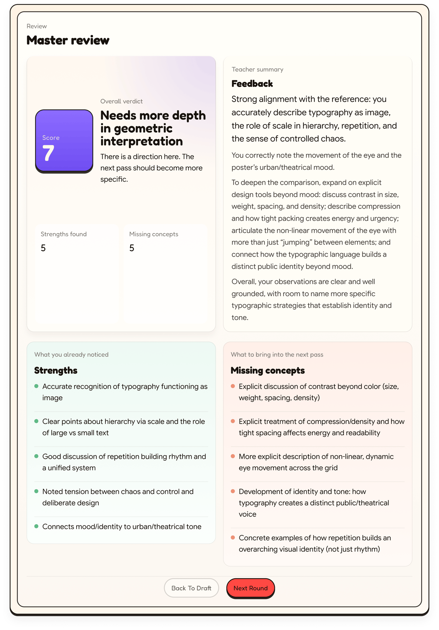
After submission, the system enters a short waiting state and then returns a structured review. This review is powered by the project’s main mechanic: comparison between the user’s essay and the hidden master analysis. The feedback highlights strong observations, identifies missing concepts, and returns an overall score to make progress more visible and motivating.
The current version already demonstrates the core learning loop, but it also revealed opportunities for improvement. The writing stage would benefit from a more educational hint system that helps the user before submission, not just after it. The review stage could also go further by making missing concepts more explanatory and more useful as teaching moments.
📝 The Rationale
What makes this project unusual is that it does not try to make learning easier by removing effort. Instead, it tries to make effort meaningful.
Most digital learning products optimize for speed, convenience, and low-friction interaction. In this project, I deliberately moved in the opposite direction. My goal was not to make design learning faster, but to make it more active. I wanted to create an experience that slows the user down and asks them to think.
I chose essay writing over quizzes, reconstruction tasks, or passive browsing because those alternatives either oversimplify interpretation or shift the focus away from reflection. The essay format is demanding, but that is also its strength: it requires attention, judgment, and articulation.
I also made a deliberate decision about the role of AI. I did not want it to act as an autonomous design critic or replace human taste. Instead, I used it in a narrower role where it is more credible: comparing a user’s analysis against a human-written reference. This keeps human expertise at the center of the learning model while using AI to make the feedback loop immediate and scalable.
Overall, the project became a UX challenge I found especially compelling: how to design an engaging digital experience around a task that is inherently effortful, and how to turn passive inspiration into active learning.